


Responsive Display
Flexible image/text units that adapt to container width.
Devices: desktop, tablet, mobile
Sizes: responsive, 300x250, 336x280, 728x90
News
Discover what to watch next.
Movies, series, and anime with guides, lists, and comparisons.
Discover MoviesExpert reviews you can trust.
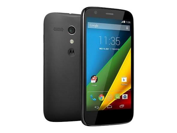
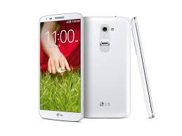
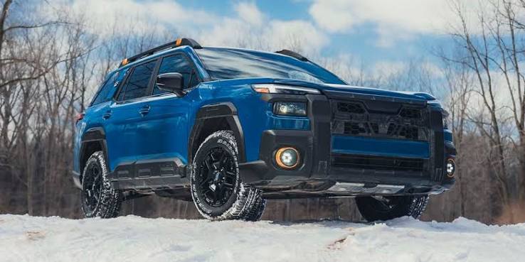
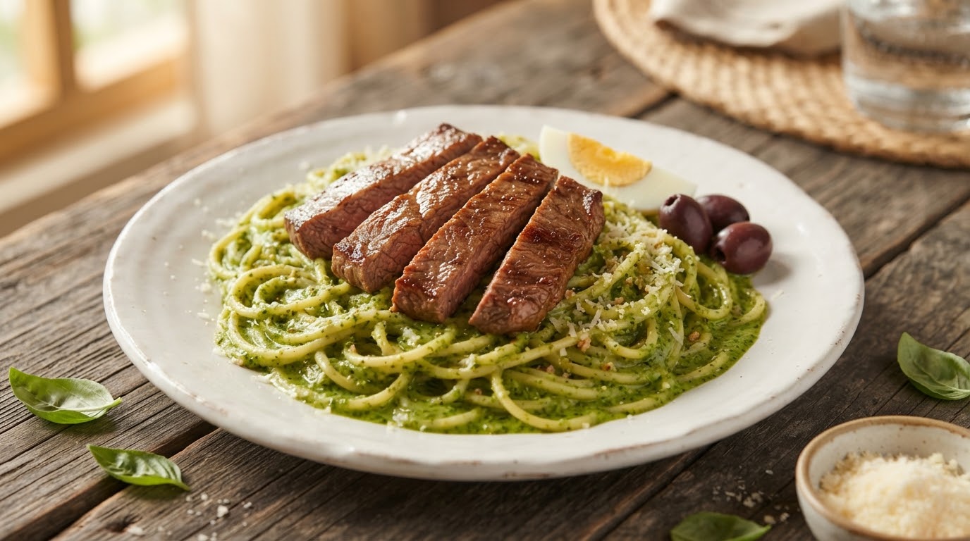
In-depth, independent reviews for phones, cars, and recipes — so you buy and cook with confidence.
Discover PhonesDevices & Vehicles
Free tools that save time.
PDF, image, text, SEO, and developer utilities — fast and free to use.
Search ToolsCategories
AI that helps you move faster.
Chat, search, and automation built around FindEdition content.
Explore AI NewsAsk, share, and learn together.
Questions, discussions, and creator spaces powered by real people.
Ask a QuestionCommunity
Legal
Partners
Build with FindEdition.
API portal, documentation, and technical resources for developers.
Read DocumentationCompany
About Contact Careers Press SupportLegal
Privacy Terms Editorial Policy Cookies DMCAPartners
Documentation API PortalPlatform
API Portal ResearchQuick Links
Search Tools Support AI AssistantPolicies
API Terms Privacy Partner InquiryFindEdition Advertising
FindEdition advertising formats: responsive display, native, sponsored content, sidebar, and more.
Formats listed here are connected to FindEdition’s advertising stack. Video/VAST and newsletter units appear only when genuinely implemented.
Each product shows purpose, devices, sizes and a truthful availability badge.
Flexible image/text units that adapt to container width.
Devices: desktop, tablet, mobile
Sizes: responsive, 300x250, 336x280, 728x90
Fixed IAB-style banners on approved placements.
Devices: desktop, tablet, mobile
Sizes: 970x250, 970x90, 728x90, 300x250, 300x600, 320x50, 320x100
Content-adjacent cards between complete listing groups.
Devices: desktop, tablet, mobile
Sizes: fluid-native
Disclosed editorial-style campaigns with review workflow.
Devices: desktop, tablet, mobile
Sizes: native
Desktop sidebar MPU where layout supports it.
Devices: desktop, tablet
Sizes: 300x250, 300x600
Premium below-hero sponsorship on the homepage.
Devices: desktop, tablet, mobile
Sizes: 970x250, 728x90, responsive
Quick planning matrix for self-service vs managed use.
| Format | Best use | Devices | Sizes | Self-service | Managed |
|---|---|---|---|---|---|
| Responsive Display | Flexible image/text units that adapt to container width. | desktop, tablet, mobile | responsive, 300x250, 336x280, 728x90 | Yes* | Yes |
| Standard Display | Fixed IAB-style banners on approved placements. | desktop, tablet, mobile | 970x250, 970x90, 728x90, 300x250 | Yes* | Yes |
| Native In-Feed | Content-adjacent cards between complete listing groups. | desktop, tablet, mobile | fluid-native | Yes* | Yes |
| Sponsored Content | Disclosed editorial-style campaigns with review workflow. | desktop, tablet, mobile | native | Yes* | Yes |
| Sidebar Display | Desktop sidebar MPU where layout supports it. | desktop, tablet | 300x250, 300x600 | Yes* | Yes |
| Homepage Sponsorship | Premium below-hero sponsorship on the homepage. | desktop, tablet, mobile | 970x250, 728x90, responsive | Yes* | Yes |
*Subject to advertiser approval, creative review and placement eligibility.
Self-service after approval, or a managed campaign across the FindEdition ecosystem. No invented metrics. No guaranteed results.
FindEdition uses first-party advertising and optional analytics. Personalized ads and external networks require your consent where applicable. See our Privacy Policy and Advertising Policies.